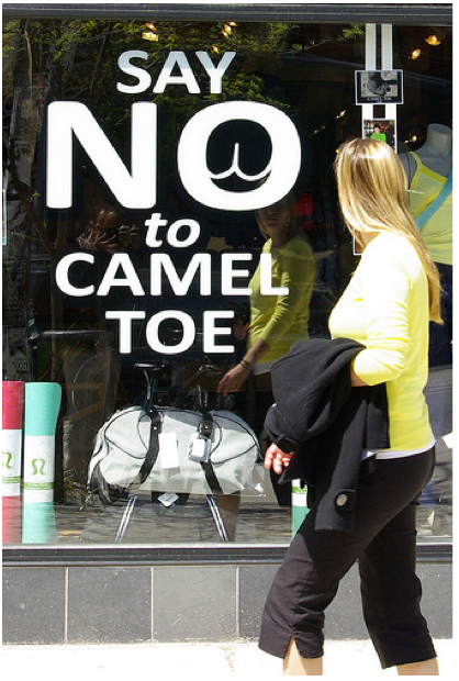
lululemon athletica‘s unapologetic new ad campaign calls it like they sees it
14th in a series:
This is what effective advertising looks like.
Lululemon continues to master the act of getting free publicity through its surprising ads (this blog is itself case in point). While they only advertise on the back of Yoga Journal, leaving we yoga-happy web sites forlorn bereft sad and unrequited, the decision hasn’t hurt them.
‘Cause when you’re ballsy (probably not the right expression in a demographic that’s 80% women) enough to call it like you see it and speak to the largely unspoken concerns of your client, your ads shall lead and the blogeratti (blogkula?) will follow.
Their latest ad campaign (which also, amazing, graces the frontage of various stores; and comes with it’s own playfully shocking “O” logo):
[galleria] Share on bsky


Read 18 comments and reply